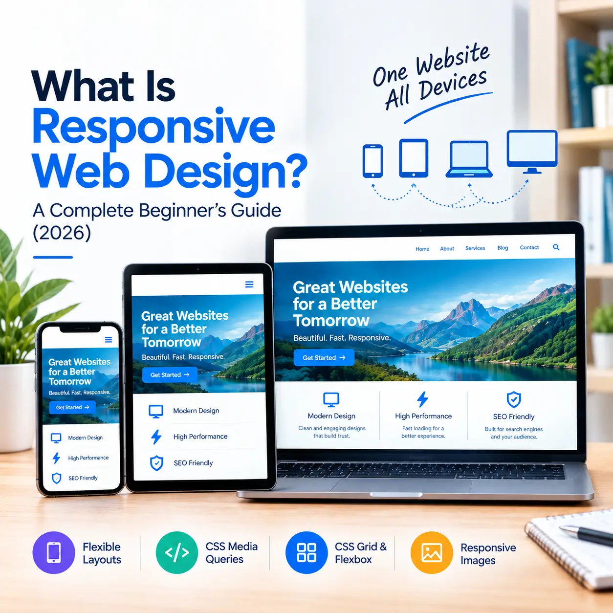
Today, there’s more than one screen to design a website for. Users access websites from all types of devices from smartphones to tablets, laptops and desktops. Not every screen size is the same so the layout of the website should change to the screen size as well. This method is commonly known as responsive web design.
A responsive website is a website that automatically adjusts its layout, images, text, navigation and other elements based on the size of the screen it’s being viewed on. This means that visitors do not have to repeatedly zoom in or scroll horizontally to use the website.
What is responsive web design?
Responsive Web Design is a method of website design and development in which a website is built so that it displays properly on mobile phones, tablets, laptops, and desktops. For example, on a desktop, a website may show three sections in one row, but on a mobile screen, those same sections may appear one below the other. Similarly desktop navigation may be converted into a menu button on mobile. Its main purpose is not to create separate websites for specific devices, but to make a single website flexible for different screen sizes.
How does a responsive website work?
A responsive website uses several important web design techniques behind the scenes. Flexible layouts help website elements adjust according to the available screen space. CSS media queries can apply different styling rules for different screen sizes. However, modern responsive design does not depend only on the viewport size. With the help of container queries, different components can also adapt according to the size of their available container.
Modern websites use CSS Grid and Flexbox to create flexible layouts. Grid is useful for complex page structures, while Flexbox is used for layouts such as rows, columns and alignment. The CSS clamp() function can also be used to make typography flexible. It allows headings and text sizes to adjust smoothly across different screen sizes.
For images, responsive image techniques such as `srcset` and `sizes` help the browser choose the correct image size
Why is responsive design important?
For a visitor, the first thing that matters is usability. If the text appears too small, the buttons cannot be clicked properly, or the user has to keep scrolling back and forth on every page, any user will leave the website within 2 minutes.
Responsive design solves this problem. Whether it is a business website, an e-commerce store, or a simple blog, the mobile experience has become just as important for everyone today. Another advantage is that maintenance becomes easier, because the hassle of managing two separate websites for desktop and mobile is eliminated.
What is the difference between a mobile-friendly and responsive website?
A mobile-friendly website means that the website can be easily used on mobile devices. Responsive websites use a special design approach in which the layout dynamically adjusts to different screen sizes.
Both are definitely related to each other, but not the same. A responsive website is usually also mobile-friendly – but being able to adjust the layout isn't everything. Navigation should be smooth, buttons should be of proper size, images should load properly, and performance should also be fast; only then do we get a real mobile-friendly experience.
What are the main elements of a responsive website?
A correct responsive website requires several essential elements. Flexible layouts adjust content according to the available space. To create a responsive website, media queries are used to adjust the design according to different screen sizes. With the help of container queries the layout of a component can change based on its available space. CSS Grid and Flexbox make layouts flexible while CSS functions like clamp() help adjust text size and spacing according to the screen. Attributes like srcset and sizes can also be used to make images responsive. Along with this, the viewport meta tag is also necessary because it helps mobile browsers correctly handle the page width according to the device. Modern viewport units like svh, lvh, and dvh are useful for managing height better in mobile layouts, especially when the mobile browser's address bar shows or hides on the screen.
Is Responsive Design Important for SEO?
Responsive Design does not directly guarantee rankings but its role is essential for modern SEO. Google uses the mobile version of a website for crawling and indexing. Therefore, mobile users must get the necessary content and functionality properly.
Responsive Design helps support different devices with a single URL and mostly the same content structure. However, just a responsive layout is not enough for SEO. Useful content, proper internal linking, crawlability, page speed, accessibility and technical SEO are also important.
How is responsive design implemented?
Flexible layout, CSS media queries, container queries, grid, and flexbox can be used. These implement responsive design during the development stage Responsive images and correct typography also help. It is important to consider different screen sizes while designing
In a mobile-first approach, the design starts from a small screen. Then it scales up to larger screens.
While creating a responsive website, it is necessary to add a viewport meta tag. Without this, mobile browsers cannot display the page in the correct width. Large images, unnecessary scripts and heavy elements can make a responsive website slow.
How to check whether a website is responsive or not?
A quick way to test a site is to slowly resize the browser window and see how the layout reacts. The text should be readable, images should not go off-screen and there should be no unnecessary horizontal scrolling. A final useful step is to open the actual website on mobile phones and tablets and review navigation, buttons, forms, images and key content. The browser has responsive design tools that developers may use to test the website on different screen widths and device conditions. Testing on just one mobile size is not enough.
What are the benefits of responsive design?
The main benefit of responsive web design is a better user experience. The website can be accessed and user-friendly on multiple devices. It can also help to keep, improve mobile usability and cut down on building a separate website for different screen sizes. Also, responsive images and well-implemented layouts can help eliminate unnecessary resources. Designing a responsive and accessible design can make a website easier to use for different users.
Why is a responsive website needed in 2026?
People will be using so many different devices to access websites by 2026 that ignoring the mobile experience will not be practical. This is especially true with mobile-first browsing and Google’s mobile-first indexing approach. Responsive design is no longer limited to the old media queries. Container queries, CSS Grid, Flexbox, fluid typography, responsive images, and modern viewport units all these tools come together to help developers create a truly flexible experience.
A modern website is not built just to look good on a desktop. Instead it is designed to work properly on every device.
3i Planet is a web design company in Udaipur that designs and develops responsive, mobile-friendly, and SEO-friendly websites. Along with web design, the company also focuses on website usability, performance, compatibility across different devices, and overall user experience, so that the website works properly on every screen and remains easy for users.